History of origin
Sep 10, 2020
iCrowdMarketing powered by iCrowdNewswire
Eclecticism flourished in the years 1830-1890. The innovators were European architects who, in search of inspiration, began to mix details from different classical movements. They tried to create something unusual and fashionable based on the familiar. Development was helped by active ties between continents: Europeans brought exotic things to their homeland from subordinate colonies and decorated houses and apartments with them. In North America, eclecticism has also taken root. Today fusion is considered his ideological follower.Eclectic and fusion styles in interior design - what's the difference?
These two directions are very similar since both are a mix. But there are differences. Chronologically, eclecticism was earlier - in the 19th century - and preferred to combine thematically similar stylistics (baroque and classic, modern, and empire). Fusion is perceived by many as a continuation of eclecticism in the 20th and 21st centuries, but this direction provides more contrasting themes: English classics, hi-tech, minimalism, ethnicity, country.
Eclectic design in a modern broad sense and fusion are usually synonymous.
General characteristics
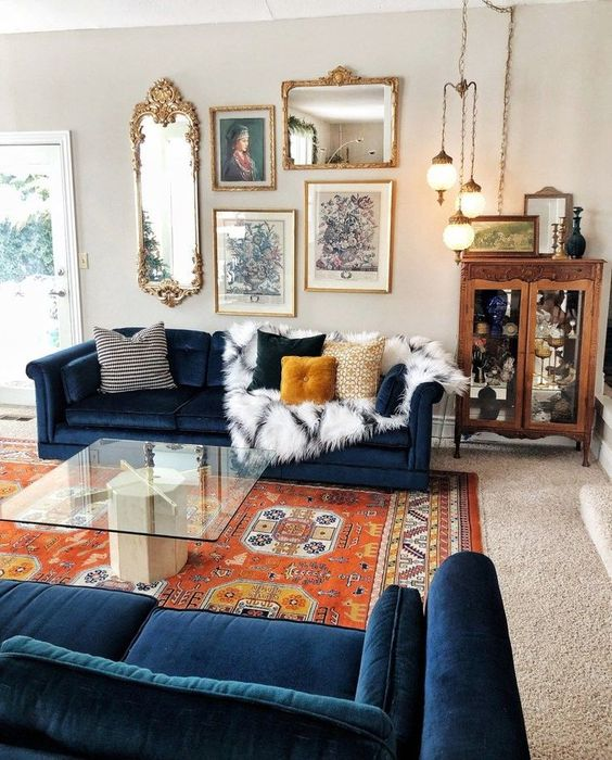
Today, eclectic design is called a design that cannot be attributed to any particular style. Does this mean that any chaotic set of objects and decorations can be considered fashionable? Not. Eclecticism is one of the most difficult interior genres precisely because it needs a balance between clever combination and bad taste.
- A mixed setting isn't for sure a collection of random things. The skill lies in choosing the right elements that complement each other without losing their individuality. You can combine traditional classics, baroque, ethnic, modern, high-tech. The question is how to do it.
- To create modern eclecticism in interiors, designers use no more than three styles. The unifying principle is a single color scheme, texture or architectural solution. If there are more directions, it is easy to slip into a mess.
- It is better to take neutral themes as a base: Scandinavian, minimalism, neoclassicism. They are good at striving for free, light space. It is easier to saturate such a base with bright objects and fill it with dynamics. In the traditional version, the classic is the base, which can be combined with baroque, gothic, rococo, colonial and ethnic elements.
- Light soothing colors (white, beige, gray) as a background for colorful accents are a way to avoid color anarchy in the design. In terms of the combinations themselves, you can safely break the stereotypes.
One of the hallmarks of eclecticism in design is contrasts.
You can, of course, mix similar themes, but the effect of contrasting combinations is much more interesting. For example, a fancy classic table and a modern chair with colorful upholstery make a great pair. If the silhouette is similar (for example, two chairs), you can play on the difference in their style.
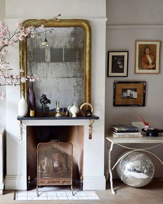
Another recognizable feature is the richness of objects and decor.
Such an environment is always filled with a variety of textile accessories (pillows, curtains, napkins), the walls are hung with paintings, photographs, mirrors. Unusual textures and ornaments dominate. Accessories are the key to the eclectic style.
Furniture selection
Vintage items are welcome: refurbished chairs, dressing tables, display cases. An advantageous contrasting addition to them will be sofas and armchairs of modern silhouettes and colors. Furniture made of different materials (wood, glass, metal) and historical eras will look harmonious if, in its selection, guided by the unity of color, ornaments, or decorative elements.
Color spectrum
Color is one of the main techniques to logically combine disparate environments. The palette depends on individual preferences, you can use almost any color - pastel and bright. It is better not to combine more than five colors so as not to drown in variegation.
Background surfaces (walls, ceiling, floor) should not compete with objects for the attention of the beholder. Their task is to beautifully emphasize and shade. Therefore, for the background, you should choose neutral, unobtrusive shades.
Tags: English